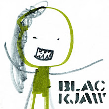
This was a concept that only made it to semi-rough stage before they decided to go with another concept that I did. Both ideas gave me some nice illustrations, but I liked this concept more. The drawing below is on step beyond the thumbnail rough.

This is the thumbnail rough:

Here is the concept that they went with:


2 comments:
Wow This seems like ages ago to me...cool poster.
I was surfing blogspot this morning at work and came across your blog. I started at the top and it took me until this post to realize that I know you! Awesome scribbles! I'm looking forward to adding it to my daily boredom-curing routine!
Katie Alston
Post a Comment